2024-10-18 ジョージア工科大学
<関連情報>
- https://research.gatech.edu/study-shows-election-data-visualization-design-can-be-powerful-persuasion-tool
- https://ieeexplore.ieee.org/document/10337772
ビジュアライゼーションにおけるテキストの役割:注釈はどのようにバイアスの認識を形成し、予測に影響を与えるか The Role of Text in Visualizations: How Annotations Shape Perceptions of Bias and Influence Predictions
Chase Stokes; Cindy Xiong Bearfield; Marti A. Hearst
IEEE Transactions on Visualization and Computer Graphics Published:01 December 2023
DOI:https://doi.org/10.1109/TVCG.2023.3338451

Abstract
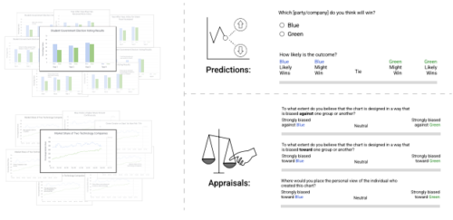
This paper investigates the role of text in visualizations, specifically the impact of text position, semantic content, and biased wording. Two empirical studies were conducted based on two tasks (predicting data trends and appraising bias) using two visualization types (bar and line charts). While the addition of text had a minimal effect on how people perceive data trends, there was a significant impact on how biased they perceive the authors to be. This finding revealed a relationship between the degree of bias in textual information and the perception of the authors’ bias. Exploratory analyses support an interaction between a person’s prediction and the degree of bias they perceived. This paper also develops a crowdsourced method for creating chart annotations that range from neutral to highly biased. This research highlights the need for designers to mitigate potential polarization of readers’ opinions based on how authors’ ideas are expressed.


